Graphs
and Visualisations
Graphs
and Visualisations| You can access the controller's graphs from the setup dialog. |  |
| Any user can view the graphs. |  |
Accessing the Graph Pages
From the home screen or the main run-screen, in monitor-mode or run-mode, press the setup button, then select the "View Graphs" icon.

 This
takes you to the graph pages.
This
takes you to the graph pages.From here you can:
- View up to eight zones in live view and view the last hour's logged data minute by minute.
- View cavity, manifold and global average traces.
- Edit the y-axis scales.
- View up to eight zones from the controller's year-long data history.
- Switch to surface map view.
- Switch to the water-zone graphs (if fitted).
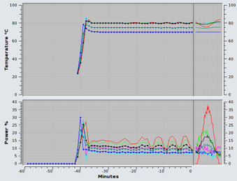
Live GraphThe live graph shows the last minute's data (temperature and power) for up to eight user-selected zones, updated every second. Additionally, it shows the last hour's data updated once a minute.
The upper graph shows the traces for temperature. Cavities will not have a trace, since there are no temperature sensors on cavities in HQ systems.
The lower graph shows the power traces.
 Edit Traces
You can add and remove up to 8 zones and 3 averages by pressing this button.
For the hour-long portion of the graph, the average traces are rendered with small circles at each data-point.
These changes also affect the history graphs.
 Edit
Scales
Edit
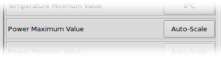
ScalesChange the y-axes upper and lower values by selecting this option.
This allows you to zoom in on areas of interest in the graph. If you select to change the maximum value for temperature or power, you have the option of auto-scaling the y-axis; enter zero to select auto-scaling. This feature selects appropriate y-axis values based on the live-view portion of the graph. The graph will constantly rescale in order to keep the traces visible.
 View
History
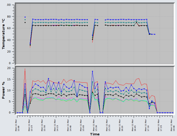
View
HistoryPress this button to switch to the history graphs. The controller stores zone data for one year. The data stored is the minute-average data for each zone.
The same zones and scale settings as the live graph view are used.
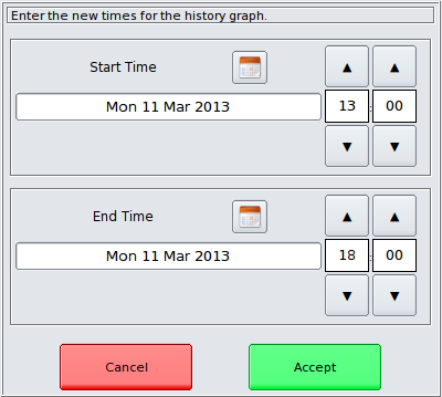
 Click the
calendar icon to change the start or end dates:
Click the
calendar icon to change the start or end dates: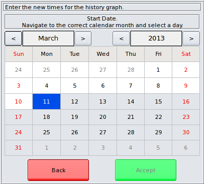 Surface
Map
Surface
MapThis visualisation tool allows you to view the cavity zones as a 3-dimensional surface. It is useful for quickly comparing the performance of all of the cavities in one graph. All the cavities are visible as pyramids set against a baseline level which is the average.
You can view average or instantaneous data, updated live every second and you can rotate and zoom the view so that relevant zones are visible.
The data which can be visualised live are:
- Power as a percentage of full power per zone,
- Power in Watts,
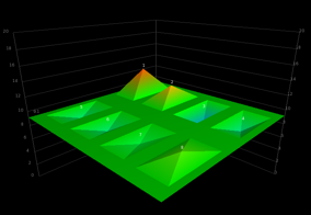
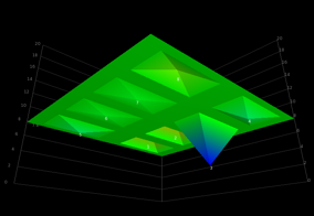
Rotate the view by touching the graph and swiping your finger.
Use the slider to zoom the view.
 Water Zone Graphs
If you have water-zones fitted, you can graph the zone temperatures and flow-rates and view the history data just as you would a normal temperature-controlled zone. Add up to eight water-zone traces and the average trace in the normal way, as described above.
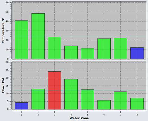
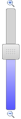
 Bar Graph
This is a useful way to visualise all the water-zones simultaneously. Each zone is represented as a bar. Green bars indicate that the zone is in-limits. Blue bars indicate a zone which is under-limit and a red bar indicates an over-limit zone. The limits can be set by a supervisor in the water-zone configuration panel.